Statistics&Probability: Association Between Variables
Statistics&Probability: Association Between Variables
Association Between Two Categorical Variables
The association between two categorical variables is summarized using counts of joint occurrences. For example, we have two categrical variables(age group & Internet use) in the following table:
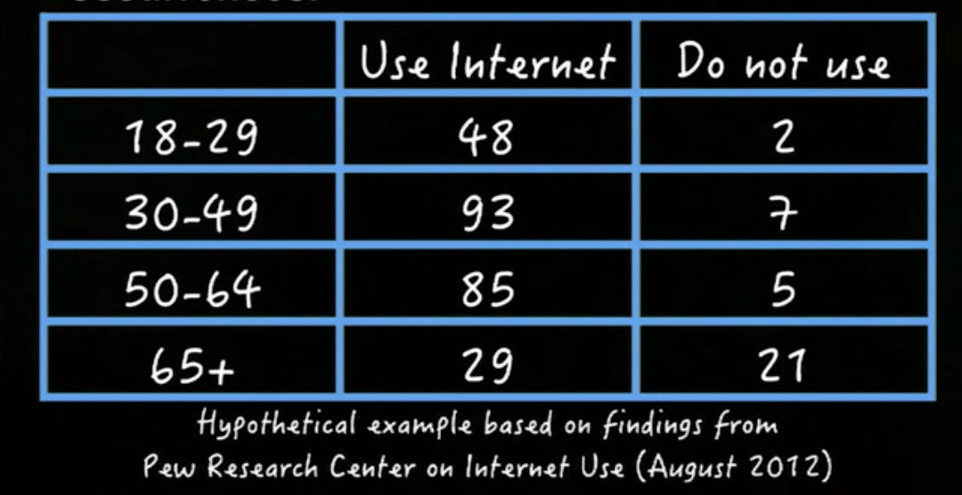
We can display the above data using a stacked bar chart:
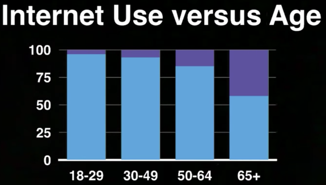
As shown, compared to the old, a high percent of young people are Internet users. And this is the association between the Internet use and the age group. But how can we measure the association between these two categorical variables?
Let’s simplify our analysis, we can see that from the data that:
- Young adults: 98% use Internet
- Senior adults: 58% use Internet
There are three ways to measure the association:
- We can first report the
difference in porportions, in this case, the difference between 98% and 58%, which is 40%.
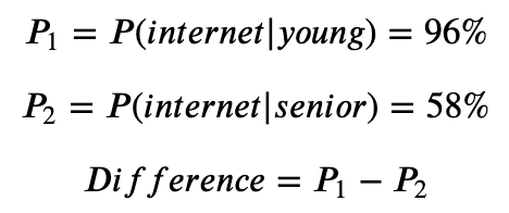
- We can compute
relative risks:
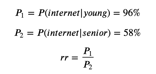
- We can compute
odds ratio:
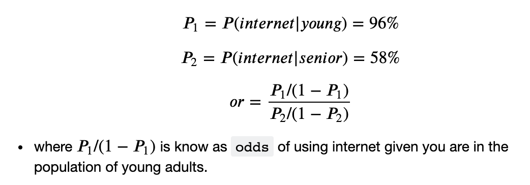
Association Between Categorical Variable and Quantitative Variable
The assciation between categorical variable and quantitative variable, can be summarized by:
- distribution of the quantitative variable (
Y) - given (or conditioning) on each value of the categorical variable(
X)
The distribution of the variable Y can be summarized using different statistics, such as the mean, the median, the quantile and the standard deviation, etc. If the two variables are associated, the distribution of Y will be dependent on the value of X.
For example, in the following chart we have displayed a categorical variable(education level) and a quantitative variable(weekly income, to be precise, the mean of the weekly income):
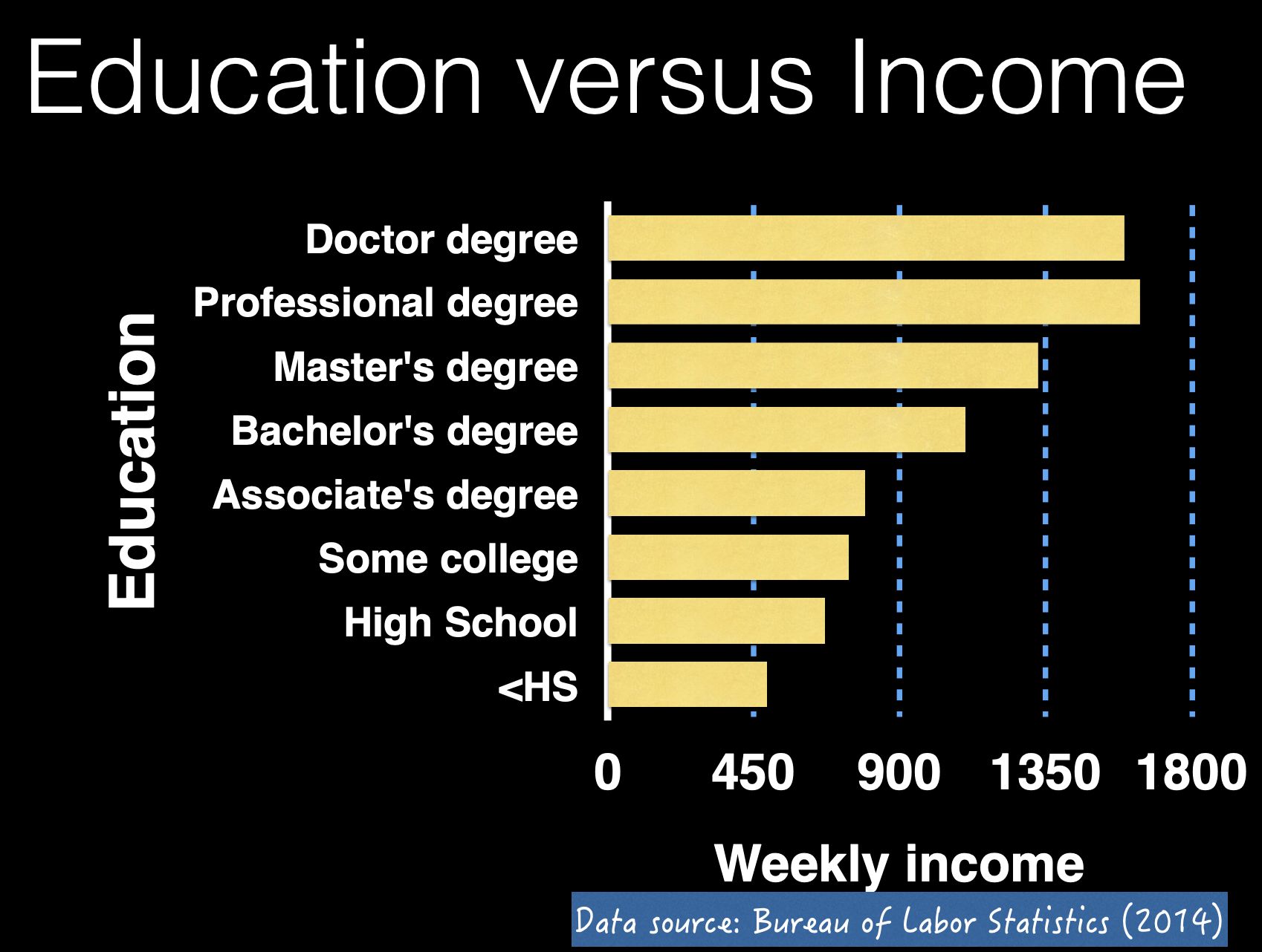
In the above chart, the distribution of the Y variable(weekly income) is summarized using the mean of the data collected. And there is a trend that for people who did not finish high school, the average weekly income is much lower than individuals who have had a higher degree. That is the association between these two variables.
How we measure the association? We can also simplify our analysis, and we can know that:
- Individuals who did not finish high school: on average
$488a week - Individuals who have finished high school: on average
$668a week
And to measure the association, we can compute the difference of the averages, in this case $668 - $488 = $180. And one factor we need to consider is the sample variation. The averages that we are looking at, the $488 and the $668 a week, are based on randomly selected individuals from two sub-population, the population of high school degree holders, and the people who didn’t finish high school. Therefore, they may not have the most accurate measure about population(cannot reflect the population in 100%). These values have sampling variabilities.
Association Between Two Quantitative Variables
The relation between two quantitative variables can be displayed using a scatterplot. For example, the following scatterplot displays the relation between the average income
of state(income per capita) and the percent of high school graduates for each state:
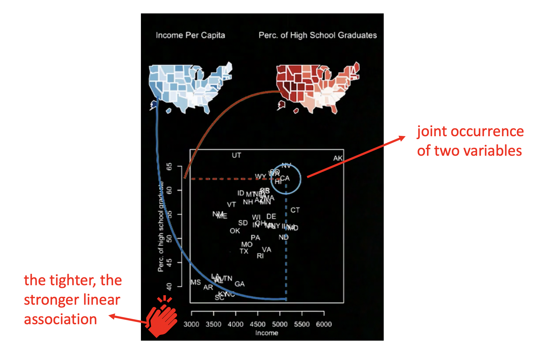
From the above scatterplot we can see that the dots of the scatterplot create a trend that’s going upwards as the x variable increase. This is called a positive association. And the tighter the points are close to a clear linear pattern, the stronger our linear association
is between the x variable and the y variable.
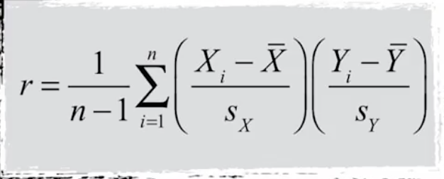
We can use correlation to measure the association. The correlation is computed like this:
We can have a scatterplot of variable X and Y:
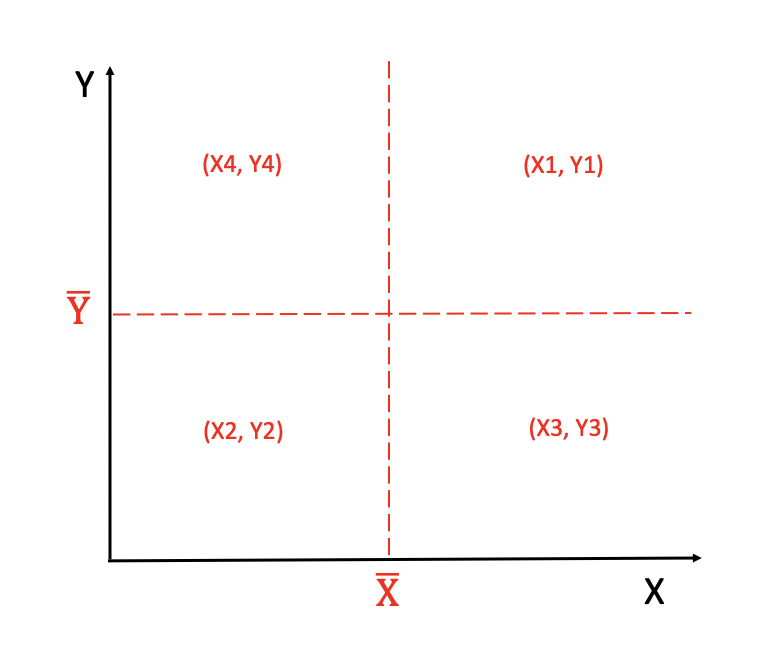
We have four regions in the above plot. (X1,Y1) and (X2,Y2) contribute positive values in the calculation of correlation, and if we have a lot of points in these two regions, the correlation will be positive. (X3,Y3) and (X4,Y4) contribute negative values, and if we have a lot of points in these two regions, the correlation will be negative.
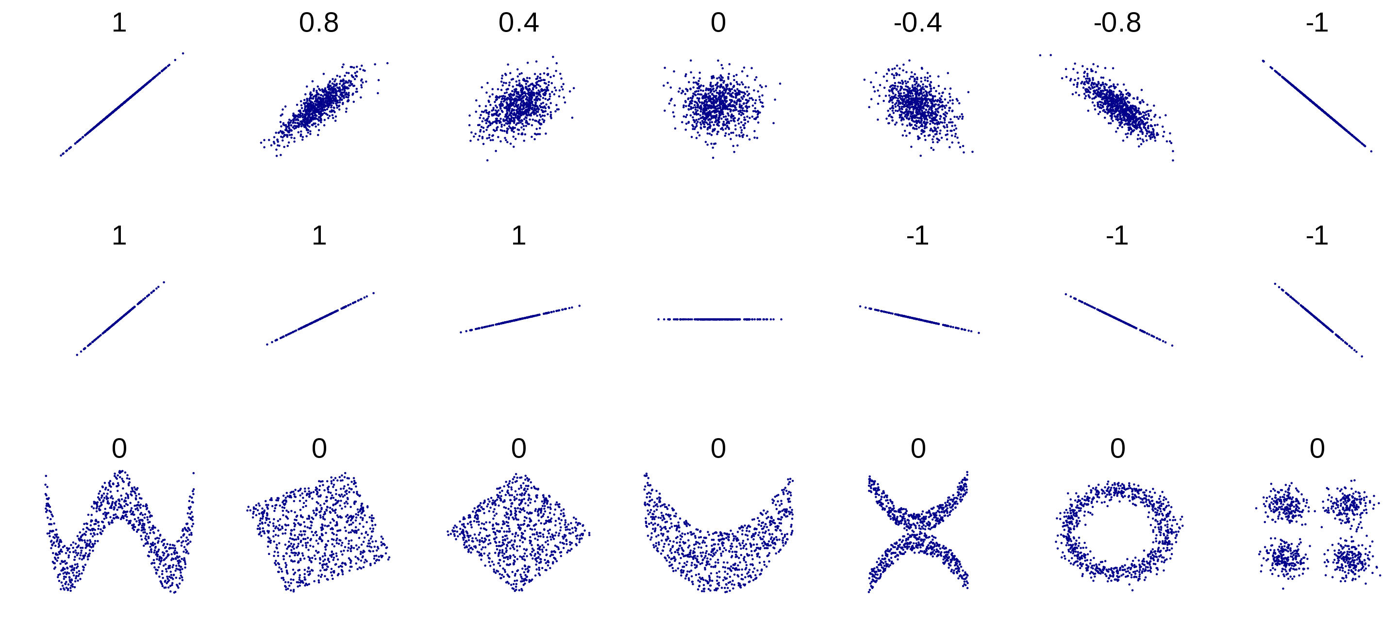
The value of correlation is always between -1 and 1:
- -1: the strongest negative linear association
- 1: the strongest positive linear association
- 0: a weak linear association(e.g., a U-shape scatterplot)
